I've just finished the second piece in a new tiki-themed series and I thought I'd post a bit of my process here on the blog.
Read MoreThey Named a Bridge After Me
Arcade Cabinet Art for Manifold
"ROS Kong" T-shirt Design
Final Artwork for 2-Color t-shirt design.
The Project
My client is a robotics company. "ROS" is an their open-source robot programming language and their mascot is a turtle. So, almost all of the designs that I make for them involve turtles. This time, they needed a shirt to commemorate a trip to Hong Kong. They want to call it "ROS Kong 2014". And initially they wanted to see some ideas incorporating King Kong and the Hong Kong skyline. That sounded interesting to me, so I got started.
Concepts
Initial Concepts for ROS Kong shirt
Taking the "King Kong" direction, I sketched out a few ideas that might incorporate ROS. The first has him swatting drone helicopters (a popular use of the ROS software). The second plays on the size of King Kong against the scale of the ROS turtle mascot. The third features a gigantic turtle shaking hands with King Kong over the Hong Kong skyline.
The Feedback
The client had second thoughts about the whole King Kong direction. They felt that maybe King Kong is too centric to New York City. But, they liked the tiny boat that I included in the foreground of the third sketch, and suggested that I might rework the design to focus on that. So, back to the drawing board I went.
The Revised Concept
The new concept, focusing on the boat
The new idea would be to have a traditional Chinese sailboat balanced atop a turtle in the Hong Kong harbor. It was also decided that a dark colored shirt would be preferred. This led me to start thinking of what colors would look good on dark grey or black. With the concept signed off on, it was time to get down to really drawing.
The Drawing
New Sketch with reference
I immediately started looking for solid reference for the boat. I knew that I wanted the turtle to be more simple and cartoony, so I didn't need too much reference with that. Originally, I was going to have drone helicopters flying around the boat but, in the end, that just seemed too busy with everything else. After I had a solid sketch figured out on the computer ( I use Sketchbook Pro on my Mac), I printed out the sketch on a big piece of paper. I used a lightbox to transfer the sketch to bristol board. Then it was time to ink.
Ink on Paper
I like drawing in ink on bristol board. It's holds ink really nice and it's more affordable than illustration board. I use a round-tip sable brush and india ink for most of the work and then touch up the rest with pens and markers. Really, I'm just looking for the best tool for whatever detail I'm working on. For this design, I'm not too worried about the different colors of black ink or the archival properties of the surface. All of this is production art for the final t-shirt design.
Into the Computer
Tracing a jpg in CocoaPotrace
My ink work was too big for one pass on the scanner, so I pieced together multiple scans in Photoshop and saved it as one jpg image. Then, I used an app called CocoaPotrace to convert the line art into vector shapes. I use CocoaPotrace instead of Illustrator's LiveTrace feature because it tends to have better results that are closer to the original artwork with fewer bezier nodes.
Adobe Illustrator
Line art in Adobe Illustrator
After I vectorized the initial ink work, I was able to bring it into Adobe Illustrator and start planning the solid black areas. It had already been decided that this image would appear on a dark colored t-shirt, so that helped me determine the balance of black and white. I added a semi-circlular shape to the background to help define lines of the turtle and boat, and then I reversed out the hull of the boat, making it black with white lines. Illustrator makes this kind of thing a lot easier than working on paper. Next, it was time to think about adding another color and text.
Laying in the 2nd color in Illustrator.
At this stage, I've figured out the right balance between the black/grey. white, and orange. A simple skyline has been added to help place this scene in Hong Kong. I also decided that the text would fit well inside the center sail, as opposed to along the bottom. In the past, I would continue to add detail in Illustrator, using the Pen tool to add more lines and sculpt other areas of the image. Lately though, I've been using a new bitmap-based program to finish what I started in Adobe Illustrator. It's called Manga Studio 5.
Finishing the Art in Manga Studio
Adding detail in Manga Studio 5
Manga Studio is a drawing program sort of like Photoshop and Painter, but it has really great drawing-specific tools and I think it's a great bridge between vector art and pixel art. I used a Wacom tablet to draw in details like reflections, turtle scales, highlights, etc. I also made a pass to fill in any weird gaps or loose lines. After everything was polished, I saved the art out as a high resolution (600dpi) tiff file.
Sign-off and Delivery
I sent an email to the client with a low-res jpg of the work along with a mock-up of the design on a suggested shirt style/color. They seemed pleased with the way that it came off and decided to go forward to production without revision. My normal flow usually includes room for a change or two, but it was great that they liked it "as is". I used DropBox to send a high resolution tiff file to their printer.
Final art for client sign-off
Mock-up on American Apparel "Ash"
That's it!
I hope that you got something out this description of my process. For me, this was a pretty straight-forward job compared to many others but it had it's curveballs. I'm trying to change up my routine to incorporate more hand drawn elements in and out of the computer. It was also a nice challenge to work in two colors in a dark t-shirt. I like the limitation of that and I think I'll do more of that in my personal work.
More posts soon!
"The Madame"
"The Madame" was created specifically for an upcoming tentacles-themed art event at Ltd. Gallery in Seattle, WA. The show features a myriad of pop-culture influenced artists and is curated by Bonnie Burton. My piece is inspired by black velvet pin-up girl art, black-light poster art, and the tireless work of Jacque Cousteau. 12x18" prints of the image are available right now at the Prints section of my website or directly below this post.
Here are some process shots of "The Madame".
Pencil/Ink sketches on paper.
Ink drawing on bristol board.
Basic vector artwork in Adobe Illustrator
Detailing in Manga Studio and Photoshop.
Ready to frame with edge-to-edge black background. Each print is signed in blue pencil.
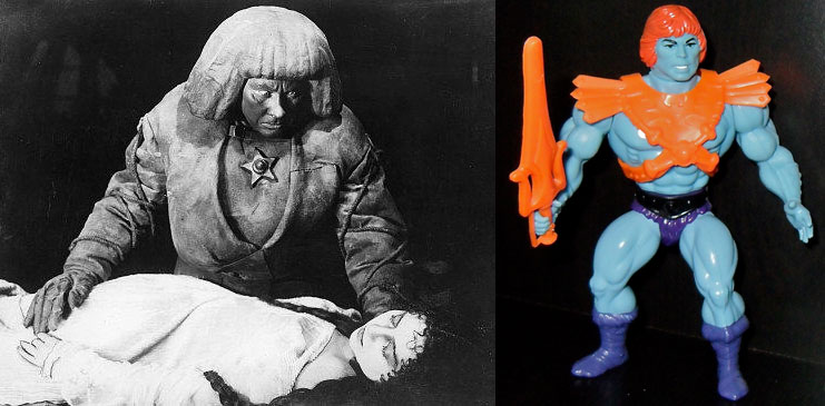
Faker and the Golem
The Golem, 1915
Faker He-Man, 1982
I was just going through some old project files and I remembered a piece that I had done that was inspired by the 1915 silent film "The Golem". In 2009, I'd been asked to participate in a Masters of the Universe themed art show in Los Angeles and I was playing around with ideas for a Faker He-Man piece. One of the things that I loved about the old He-Man cartoon was the underlying sense of mysticism. There seemed to be some dark past and cosmic power that was only hinted at in the goofy stories but sometimes it came out in the character and set designs. Wasn't Castle Grayskull actually a giant skeleton? What the hell was that about?
So, when I started thinking about Faker, the artificial robot replicant of He-Man, I started thinking about mysticism and other artificial creatures. I remembered the Golem from Jewish folklore and did some research online. One of the first things that popped up was the creature from the 1915 film "The Golem" and wouldn't you know it, he and Faker share a bowl-cut hairstyle. I knew I was on the right path.
I had also been reading "The Cosmic Serpent", anthropologist Jeremy Narby's clandestine account of learning the secrets of nature through hallucinogenic plants in the Amazon jungle. These secrets were delivered to him by twin neon snakes, cosmic serpents that appear again and again in different cultures. Well, this worked really well in the He-Man mythos. Snakes are everywhere and integral to the story of the main villain Skeletor. So, I decided that the piece would imply that Faker predated Skeletor and was somehow connected to the Cosmic Serpents. In the final painting, Faker and baby Skeletor are flanked by two Beastmen and the snakes intertwine them.
Here are some process shots and the final piece.
Process - Twintail
Here's a little walkthrough of my general process in making artwork. This piece in particular was for a Japanese toy monster art show. This character is called Twin Tail. Here's what I did to make my drawing of Twin Tail:
1)I generally start with a sketch on paper. For this one I used some Col-Erase Pencils. I like them because each color has it's own hardness of lead. Also, if I start with one color, I can tighten up a drawing with another color and see where I've been.
2)I scan the sketch or take a photo of it and put it into Adobe Illustrator on it's own layer. In the layers properties, I choose "Dim Images to 50%" for the layer with the sketch. I usually lock this layer, create a new layer on top, and start tracing with the pen tool.
3)Once all the important lines are dropped in, I scale and manipulate the image as needed. Then, I select all the lines and turn them into outlines (Object>Path>Outline Stroke). I then manually nudge all the lines to achieve the thin to thick look that I want. This takes a while to get fast at ;)
4) Behind the line art, on it's own layer, I create areas of flat color. I also knew that for this one I didn't want many black lines, so I made all the lines a color with the intention of changing them later.
5 and 6) At this point it's really about "painting" in the details and highlights on various layers, It's important to keep your layers organized. Merge and label. Oh, and save often.
Case Study - GFW
| I was lucky enough to work with Games For Windows Magazine (fomerly Computer Gaming World) on more than a dozen double-page spreads with accompanying spot illustrations. Every issue was a different challenge to communicate something visually to an audience that's been oversaturated with visual stimulus for years. They were really open to different ideas and styles. Below are some of the projects that we worked on together. |
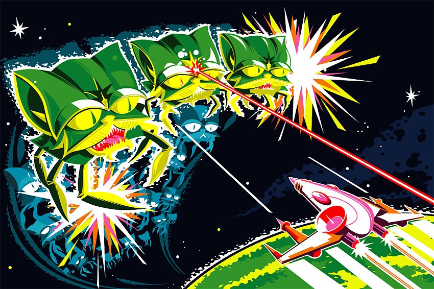
| Galagato, 2006 This was the first spread that I did for CGW. The article was about the swarm of online PC games freely available on the internet. The direction was to depict some sort of swarm. I had just returned from Portland, OR where I spent a lot of time at Ground Kontrol Retro Arcade. The place is loaded with fully retored game cabinets from the 80's and I was pumped to make some vintage arcade inspired art. The art director graciously tolerated my insistance for this style and we went with it. |
| Invaders, 2007 This illustration was about the onslaught of in-game advertising in PC games. I was still interested in exploring imagery from the roots of video games, so this piece features space invaders. It was important to the article that we include as much branding as possible in the spread. Unfortunately, the final,printed image was cropped and obscures the Funyuns bag. |
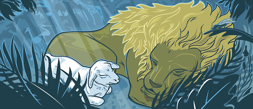
| Midnight in the Garden, 2007 One of most interesting articles during my run with GFW was a feature on "The Hidden World of Christian PC Games". Apparently, Christian bookstores often carry exclusive video games specific to the Christian Faith. The function on the article was to be impartial and just unearth this subset of games to a wider audience. I decided to illustrate the idea by showing a scene in the Garden of Eden at night time. |
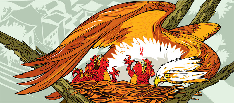
| Eagle with Baby Dragons, 2007 This spread was for an editorial about American games companies moving operations to China and nurturing those new jobs.The art direction called for some kind of chinese dragon and maybe an eagle. I chose to depict a mother eagle tending to her surrogate dragon chicks. |
| Stormcheaters, 2007 This was a spread for an article about cheaters in massively-multiplayer games. Some people will go to great lengths to gain power in a game, even if it means taking advantages of flaws in the system, or preying on newbies. The original direction of the art was to use fantasy-based characters cheating on a test, but it evolved into something more universally familiar and was a lot more fun in the end because of it. |
| More of my artwork for Games for Windows Magazine can be seen by visiting my Artwork by Client collection on Flickr. |
Ink is the New Black
This is something new that I'm working on. I plan to add a lot of color to it soon, but it's refreshing to work with more lines.


