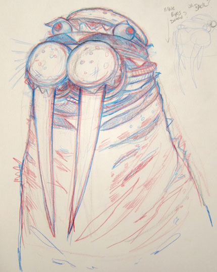
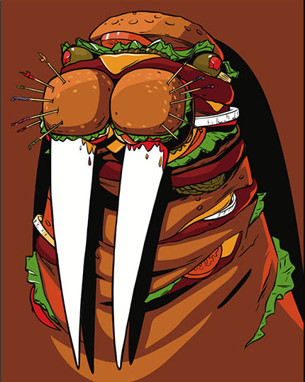
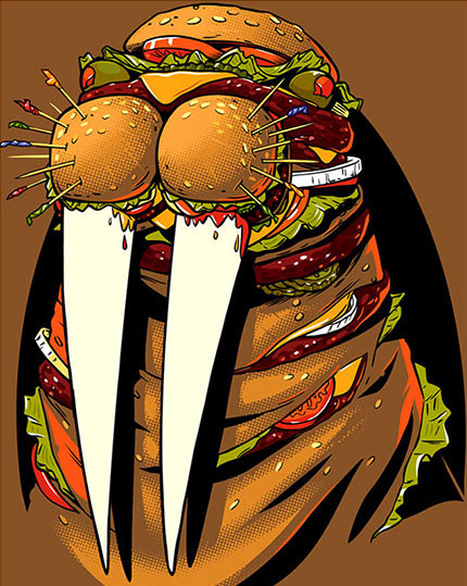
Earlier this year, I designed a Burger Walrus t-shirt for Upper Playground's 15th anniversary. They've just released it on their website. When I was asked to make a design, they suggested that something Bay Area centric or Upper Playground specific would be a good direction. I decided that it would be interesting to make the Upper Playground walrus mascot out of hamburgers. The initial sketch was like some sort of mutated amalgamation of a walrus and cheeseburgers, like "The Fly" meets the Double Double. I almost dismissed the idea as too absurd but there was something about the concept that stuck with me, so I went with it.
Original doodle for the Burger Walrus design.
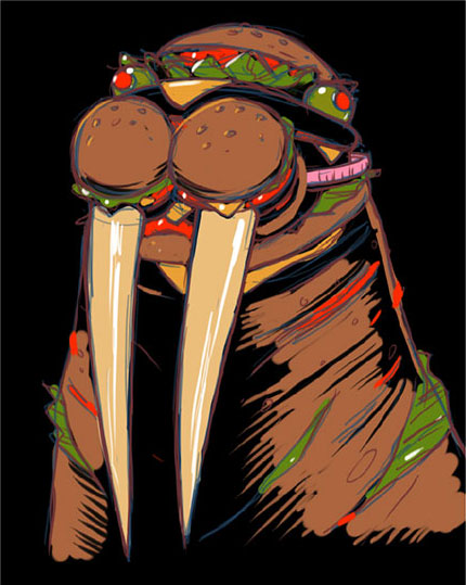
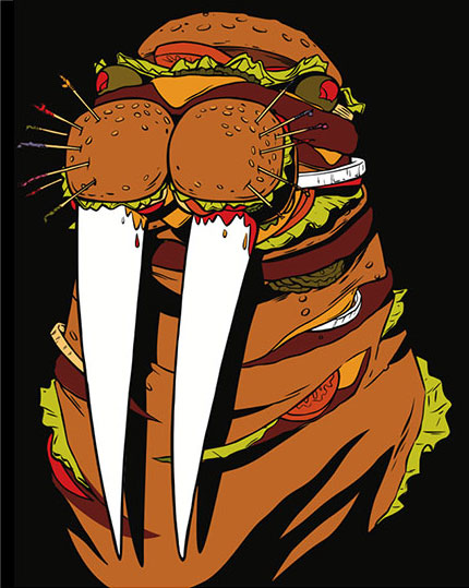
Above are some of the steps along the way for the development of the Burger Walrus design. Usually I go from the initial doodle to a more refined sketch on paper. Because this design was going to be on a dark colored shirt, I decided to sketch on the computer instead since it's easier to work on a black background that way. Once those color choices were nailed down I printed out my digital sketch and transferred it to a large sheet of bristol board for inking. I inked the drawing with a #2 sable brush and india ink. Then, I brought the ink drawing back into the computer by scanning it in chunks and reassembling it in Photoshop. I used an ancient piece of software called Potrace to turn the scan in to vector art for use in Adobe Illustrator. I've "inked" things directly in Illustrator before, but nothing beats pen/ink lines and Potrace does a great job keeping them close to the original.
Pen/Ink on bristol board
The chunky halftone starts as a gradient in Illustrator.
After I had the basic flat shapes placed in Illustrator, I wanted to add some texture. I like the graphic quality of gritty screen printed halftones.To achieve this look in Adobe Illustrator, I make some greyscale radial gradients (above left) and then chose Pixelate>Color Halftone from Effect menu item. As long as the gradient is greyscale, you get a black-and-white halftone. To get that blown-out look, I exported those halftones as jpegs and ran them through CocoaPotrace, turning them into vector art. I did this for different shades of brown and layered them together in Illustrator.
Once all the lines, colors, and textures were in place, I wanted to make another pass with details. There were things that I wanted to pop forward and some minor errors that needed fixing. Lately, I've been using Manga Studio and my Wacom tablet to dig in and iron out the last bits. So, from Adobe Illustrator I exported a high-resolution (600dpi) tiff file and opened it up in Manga Studio. Manga Studio costs about $50, but its pen tool is the smoothest ink equivalent I've ever used. It's a great bridge between vector art and bitmap. I went through and added some lighter colors, defined some edges around the eyes and toothpicks, and just generally tightened up the artwork. The last step was a quick color correction in Photoshop.
I'm very happy with the way it turned out. Lots of thanks to Jeremy Fish at Upper Playground for letting me run with this crazy concept. I hope that fans of burgers and walruses everywhere enjoy it too.
Detailing in Manga Studio 5

