"ROS Kong" T-shirt Design

Final Artwork for 2-Color t-shirt design.

The Project

My client is a robotics company. "ROS" is an their open-source robot programming language and their mascot is a turtle. So, almost all of the designs that I make for them involve turtles. This time, they needed a shirt to commemorate a trip to Hong Kong. They want to call it "ROS Kong 2014". And initially they wanted to see some ideas incorporating King Kong and the Hong Kong skyline. That sounded interesting to me, so I got started.

Concepts

Initial Concepts for ROS Kong shirt

Taking the "King Kong" direction, I sketched out a few ideas that might incorporate ROS. The first has him swatting drone helicopters (a popular use of the ROS software). The second plays on the size of King Kong against the scale of the ROS turtle mascot. The third features a gigantic turtle shaking hands with King Kong over the Hong Kong skyline.

The Feedback

The client had second thoughts about the whole King Kong direction. They felt that maybe King Kong is too centric to New York City. But, they liked the tiny boat that I included in the foreground of the third sketch, and suggested that I might rework the design to focus on that. So, back to the drawing board I went.

The Revised Concept

The new concept, focusing on the boat

The new concept, focusing on the boat

The new idea would be to have a traditional Chinese sailboat balanced atop a turtle in the Hong Kong harbor. It was also decided that a dark colored shirt would be preferred. This led me to start thinking of what colors would look good on dark grey or black. With the concept signed off on, it was time to get down to really drawing.

The Drawing

New Sketch with reference

I immediately started looking for solid reference for the boat. I knew that I wanted the turtle to be more simple and cartoony, so I didn't need too much reference with that. Originally, I was going to have drone helicopters flying around the boat but, in the end, that just seemed too busy with everything else. After I had a solid sketch figured out on the computer ( I use Sketchbook Pro on my Mac), I printed out the sketch on a big piece of paper. I used a lightbox to transfer the sketch to bristol board. Then it was time to ink.

Ink on Paper

I like drawing in ink on bristol board. It's holds ink really nice and it's more affordable than illustration board. I use a round-tip sable brush and india ink for most of the work and then touch up the rest with pens and markers. Really, I'm just looking for the best tool for whatever detail I'm working on. For this design, I'm not too worried about the different colors of black ink or the archival properties of the surface. All of this is production art for the final t-shirt design.

Into the Computer

Tracing a jpg in CocoaPotrace

My ink work was too big for one pass on the scanner, so I pieced together multiple scans in Photoshop and saved it as one jpg image. Then, I used an app called CocoaPotrace to convert the line art into vector shapes. I use CocoaPotrace instead of Illustrator's LiveTrace feature because it tends to have better results that are closer to the original artwork with fewer bezier nodes. 

Adobe Illustrator

Line art in Adobe Illustrator

After I vectorized the initial ink work, I was able to bring it into Adobe Illustrator and start planning the solid black areas. It had already been decided that this image would appear on a dark colored t-shirt, so that helped me determine the balance of black and white. I added a semi-circlular shape to the background to help define lines of the turtle and boat, and then I reversed out the hull of the boat, making it black with white lines. Illustrator makes this kind of thing a lot easier than working on paper. Next, it was time to think about adding another color and text.

Laying in the 2nd color in Illustrator.

At this stage, I've figured out the right balance between the black/grey. white, and orange. A simple skyline has been added to help place this scene in Hong Kong. I also decided that the text would fit well inside the center sail, as opposed to along the bottom. In the past, I would continue to add detail in Illustrator, using the Pen tool to add more lines and sculpt other areas of the image. Lately though, I've been using a new bitmap-based program to finish what I started in Adobe Illustrator. It's called Manga Studio 5.

Finishing the Art in Manga Studio

Adding detail in Manga Studio 5

Manga Studio is a drawing program sort of like Photoshop and Painter, but it has really great drawing-specific tools and I think it's a great bridge between vector art and pixel art. I used a Wacom tablet to draw in details like reflections, turtle scales, highlights, etc. I also made a pass to fill in any weird gaps or loose lines. After everything was polished, I saved the art out as a high resolution (600dpi) tiff file.

Sign-off and Delivery

I sent an email to the client with a low-res jpg of the work along with a mock-up of the design on a suggested shirt style/color. They seemed pleased with the way that it came off and decided to go forward to production without revision. My normal flow usually includes room for a change or two, but it was great that they liked it "as is". I used DropBox to send a high resolution tiff file to their printer.

Final art for client sign-off

Mock-up on American Apparel "Ash"

That's it!

I hope that you got something out this description of my process. For me, this was a pretty straight-forward job compared to many others but it had it's curveballs. I'm trying to change up my routine to incorporate more hand drawn elements in and out of the computer. It was also a nice challenge to work in two colors in a dark t-shirt. I like the limitation of that and I think I'll do more of that in my personal work.

More posts soon!

Year in Pics, 2013

Well, that was fast! It's dark around 5pm now and all I crave is fudge and spiced wine. That can only mean that it's December again, which also means it's time for my annual Year in Review! 2013 was a big one, filled with travel and art. I met many of you this year, and I hope to stay in touch with you going into 2014.
Here's a link to a Flickr set with some of my favorite moments of 2013. Listed below are some highlights.

astronaut.jpg

Jan-March

I turned 36 in January, which is only crazy in that I remember when my mom turned 36, because I was graduating high-school! So, drinking happened. I finished off my run of 200 Slimer whiteboard drawings, met a real-life astronaut while tabling Emerald City Comic Con and exhibited at a tarot card themed show in San Francisco.

monochrom.jpg

April-June
Spring and Summer was a big deal! I spent a month in Europe, showing artwork in Monochrom's 20th Anniversary show and creating a mural in the Austrian countryside. It was an incredible experience. Here are some Vine videos from the trip. I started a temp job when I got back and developed an obsession with the San Francisco F-Line train.

pigeon.jpg

July-Sept
I found my true calling as a pigeon, nerded out with my new button machine, and also managed a trip back to Michigan to spend some time with family. Time was spent at diners and bowling alleys. My artwork was also part of the Laughing Squid Quarterly mailing, which was really cool.

banner.jpg

October-November
This Fall I exhibited at APE and Barbot in San Francisco, and then Comikaze Expo and DesignerCon in LA. I met a lot of great people and reconnected with old friends. I also started a series of drunk Twitter bird paintings and sketches that I'm calling "Drunktweets". Maybe you've heard of them.

treebirds.jpg

Here Comes 2014!
Right, so Christmas is soon and I'll be flying back to Michigan to be with the Ellingson clan. We go kind of nuts for Christmas and I'm looking forward to that. Then, it's my birthday again and more drinking. But look out for more posts about art events soon! I'll be exhibiting at Emerald City Comic Con in Seattle and Wondercon in LA. Beyond that, it's a magical mystery. I'm sure I'll obsess more over the F-Line, art will be made, food will be burnt. Please stay in touch. Follow me on InstagramTwitter, and the Facebook.

As always, prints of my artwork art available for sale at my website here:
http://ellingson.cc/prints
Handmade things like the Drunktweets and buttons are available on Etsy here:
https://www.etsy.com/shop/ELLINGSON
Use the code YEAREND13 for 20% any purchase through December 31st 2013
(works for both Etsy stuff and my prints.)

*Due to travel, all orders will ship after January 6th, 2014

RIP Kumar Pallana

I just found out that one of my favorite character actors, Kumar Pallana has died. He was 94. Pallana was in a number of Wes Anderson films in comedic side-character roles. When I first saw him in Bottle Rocket, I assumed that he must have been some kind of family friend of Wes Anderson that he thought was funny and put him in a movie. He just didn't seem trained. I recently learned that Kumar was a seasoned actor and vaudeville comic. According to Wikipedia, he was also on the Mickey Mouse Club.

In 2011, I was asked to contribute a piece of artwork to Spoke Art's "Bad Dads" show, a tribute to the films of Wes Anderson. I knew immediately that I wanted to draw Kumar from him role in the film "Bottle Rocket". 

Kumar in "Bottle Rocket"

Here's a little animation that shows the progress of drawing Kumar's face for the "Bad Dads" show print. His expression is very subtle and was a little tricky to capture.

The final artwork was created mostly in Adobe Illustrator. I've found that, while Illustrator is great for graphic work with solid shapes, it's not always easy for skin tones and softer elements. For this piece I used a half-tone effect to get the graphic-ness that I wanted but a more skin-like texture on the face. 

New for Fall - Buttons!

Gold Tooth x Crossbones with gold/silver leaf

Gold Tooth x Crossbones with gold/silver leaf

 (Masters of the Universe buttons - not gold leafed)

 (Masters of the Universe buttons - not gold leafed)

As I write this, I can smell the neighbor's BBQ through the window, my allergies are in full effect, and it can only mean that it's Labor Day again. Congratulations. You made it through Summer.
I have a new button machine in the studio and I've been pressing special gold and silver leafed designs. The shiny gold leaf stand out against the matte finish of the black button. You're going to really like these in person. They are available on Etsy for $6 per 2-pack($3 shipping US only). I also sell boxes of eight gold teeth, for you and seven of your friends. Check them out and stay tuned for more designs. As evidenced by my  Instagram feed, I'm crazy about my button maker.

Fall also means Convention Season has started. I'll be back on the road, selling my art from city to city. Here's where you can find me:
October 11-12th at APE in San Francisco
November 1-3rd at Comikaze Expo in Downtown LA
November 9-10th at DesignerCon in Pasadena, CA
Hope to see you there!


"Curious Zero"

I created "Curious Zero" as a special print for an in-store signing at ZeroFriends Store in San Francisco. ZeroFriends has a special gallery on the back wall of the shop that showcases various artists' interpretation of their mascot, Zero. I thought it might be fun to suggest that zero is a space monkey with a yellow robotic companion. The idea bounced around in my head for a few months and after a couple of false starts, I got a solid design down on paper. For the robot, I decided to resurrect an old design from my self-published comics days. For the monkey, i went back and forth with different creepy designs but settled on a cute-yet-alien version. Prints of "Curious Zero" are available in the Store section of my site. Below are a few process shots.

photo 3.JPG

Chase No Face KidRobot Trikky

chasefigure.jpg

I just finished painting this KidRobot 7-inch "Trikky" vinyl figure. It's inspired by Chase No Face, one of my favorite internet-famous animals. Chase was featured on BoingBoing a couple of years ago when I was drawing lots of meme pets. I was fascinated by her story and created a quick portrait. While shopping for art supplies, I came across KidRobot's MUNNYWORLD figures and thought the "Trikky" charracter would make a great Chase No Face custom.

I use Holbein Acryla Gouache paints for most of my painted work and it works great on vinyl figures. I like the consistency of the paint, it thins easily with water, and it dries opaque very quickly. I use whatever brushes I have around, usually a small flat and a couple of round liners. In the past, I've masked off every detail of a custom figure to get really flat shapes, but that's just way too time consuming. This time, I just blocked everything in with a Col-Erase pencil right on the blank figure and started in with brush and paint. Here's a photo of the Trikky in the box and one mid-paint:

Blank MUNNYWORLD Trikky in box. 

Blank MUNNYWORLD Trikky in box. 

Mid-paint. 

Mid-paint. 


The vinyl figure is a one-of-a-kind item. I'm not sure if it's for sale just yet but I'll entertain offers. In the meantime, here are some other Chase related things that I've made. 

"Chase No Face" by Olga Bell

My Art in Laughing Squid Quarterly

#LSQ01

photo by Rusty Blazenhoff

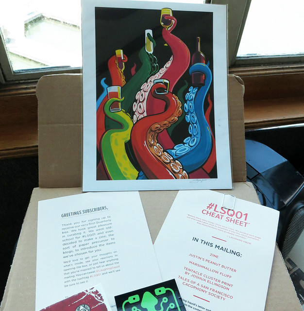
I'm proud to announce that my "Tentacle Cluster" image was included with lots of other fun stuff in Laughing Squid's first Quarterly.co mailing. With Quarterly, people sign up for monthly gifts curated by their favorite websites and internet personalities.  If you missed out on the mailing, you can get a "Tentacle Cluster" print directly from me here in the Store section of my site.

BONUS- Get 20% off any order in my store with the coupon code #LSQ01 at checkout.